
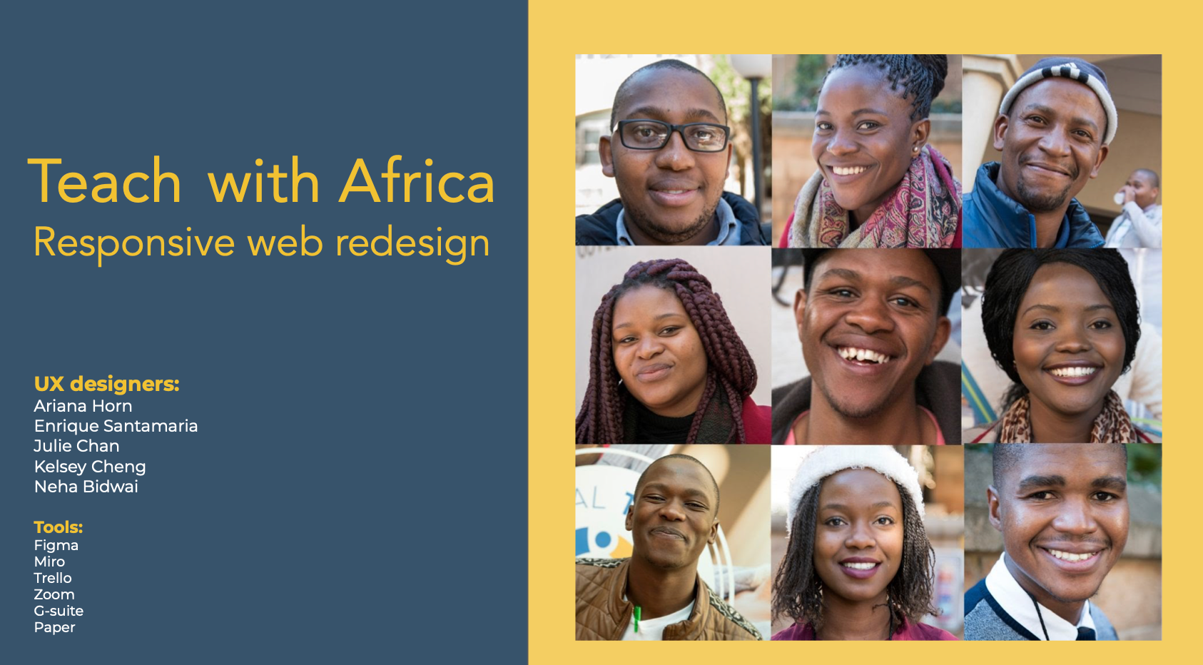
About
Teach with Africa is a Non-Profit Organization with the goal to work on access to high-quality education, professional development learning, and teaching AFRICA/US to transform children's lives in a third-world country/destination.
Case Study Overview
User-focused inspiration/motivation project, the focus of redesigning a non-profit organization. Redesigning this Non-Profit, was to bring valuable skills in an inspirational field in a current growing topic. The design of the "old" website was very bold in color and heavy with information. As a team of five people, we focused on the main points/needs of the users. The goal: Creating a clean and clear design, with an outcome to establish subconsciousness to reenter the website, or even recommend it to other possible users.
Project
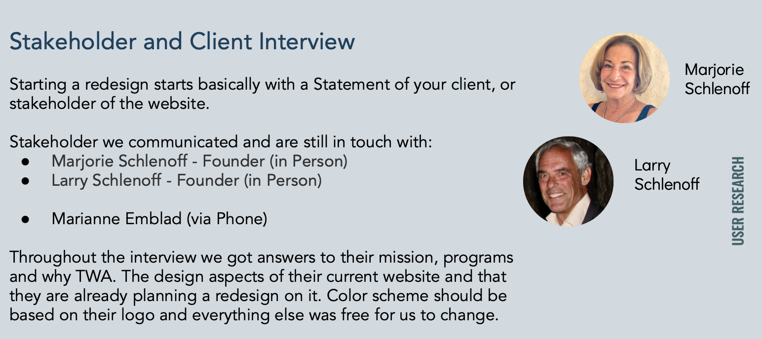
User Research and Stakeholder Interview
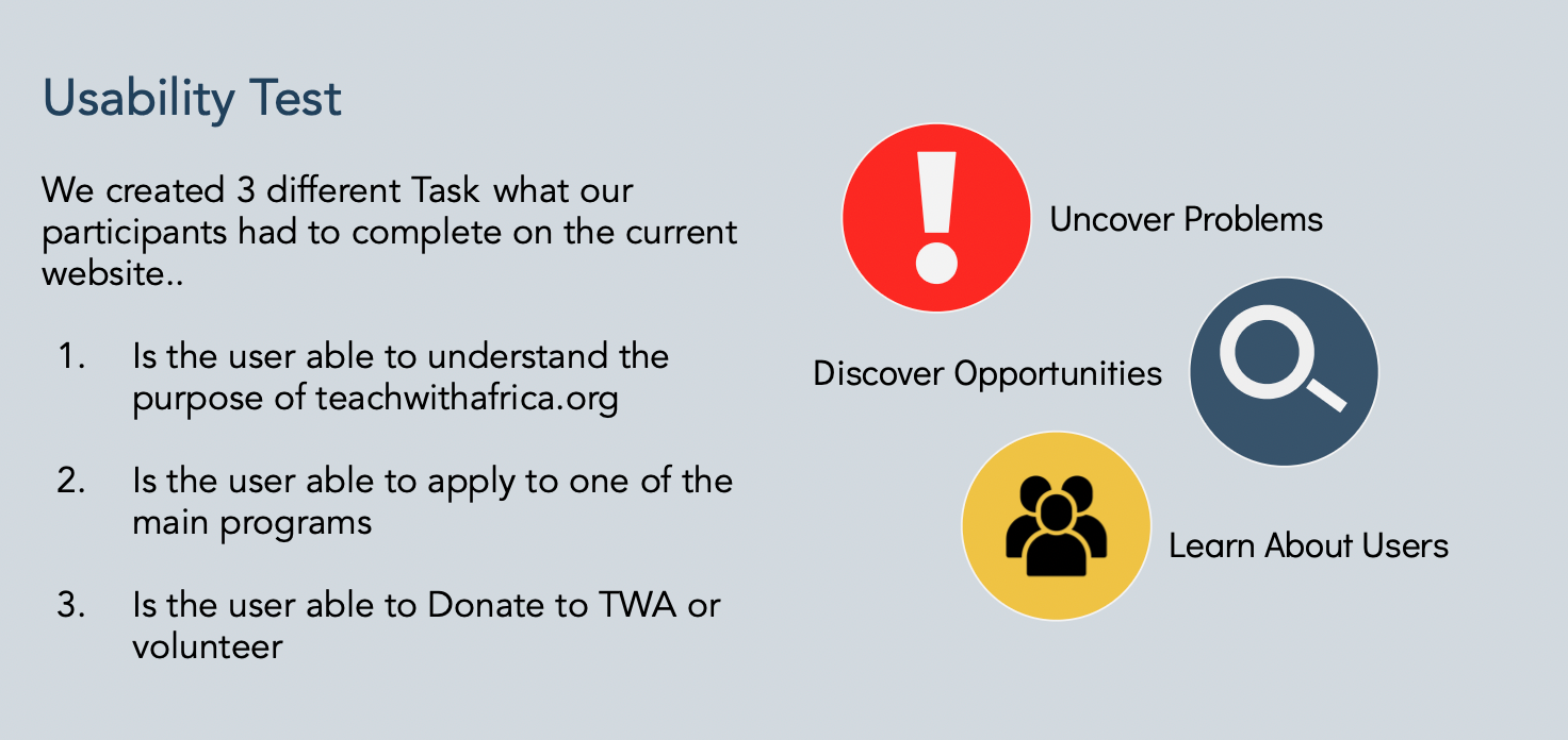
Staring an RWD for an existing website starts with the right approach. Every step of USER RESEARCH has to be covered. When we started to redesign the "Teach With Africa" website we informed us about competitors and started to contact client and stakeholder.
After a detailed discussion with our Client about "Teach With Africa", were we able to start over to the next steps as well as user ability tests and interviews.
After a detailed discussion with our Client about "Teach With Africa", were we able to start over to the next steps as well as user ability tests and interviews.
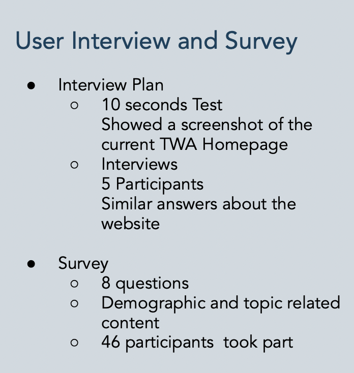
User Interview and Survey Evaluation
Visual
Red color is too bold/aggressive and too much text
Red color is too bold/aggressive and too much text
Navigation
every categorie looks like alert, hidden content and many things do not even work
every categorie looks like alert, hidden content and many things do not even work
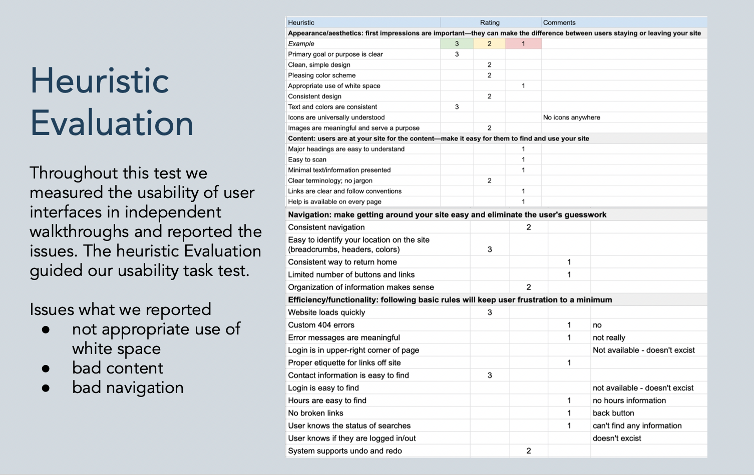
Major Pain Points
unclear content, can’t figure out what this all is actually about and page looks not trustworthy
unclear content, can’t figure out what this all is actually about and page looks not trustworthy
Content
confusing and unintuitive
confusing and unintuitive
Missing
missing home button and no link to programs
missing home button and no link to programs
others
Persona
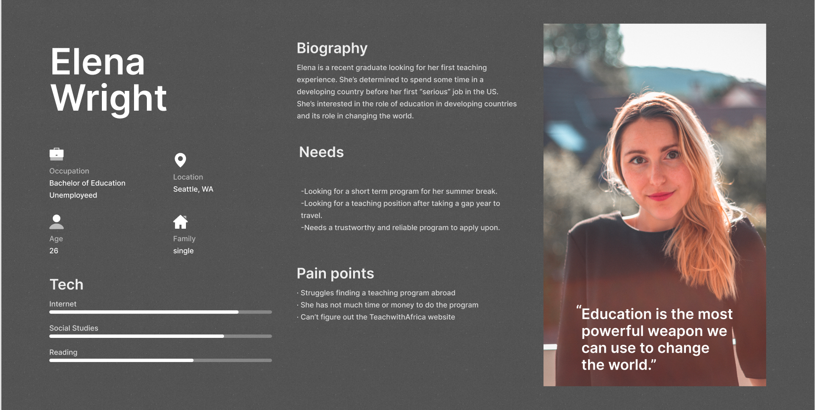
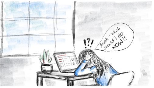
Our team set out to learn more about our customers to formulate our services to their needs. After the usability user testing, we filtered out pain points, likes, and wishes to create a user persona. Due to all this information we created Elena Wright, is a recent graduate, who wants to collect as much experience as possible before stepping into a teaching position in her home country. Her needs are to find a short-term program, that is trustworthy, and to apply upon. But she has the struggle to find a good program and can’t figure out what the TWA WEBSITE is doing.
Storyboard
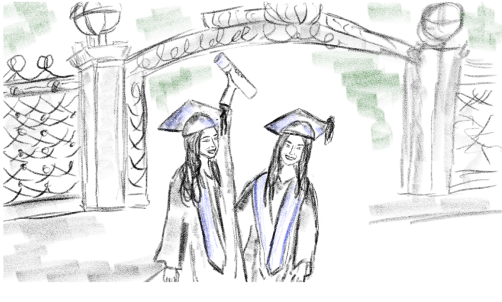
1. Elena just finished her studies and is looking forward to starting her life as a teacher. But she knows already that she doesn’t want to jump straight into a teaching job in the US.
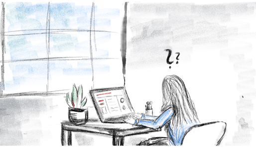
2. Back at home, she starts her research by browsing what programs she can join, and how she should go about teaching abroad.
3. Elena becomes overwhelmed. Many non-profit organizations offer jobs as a teacher in different countries, but they all aren’t appealing to her needs. It is just frustrating to navigate through every webpage because she can’t find any information on their main homepage.
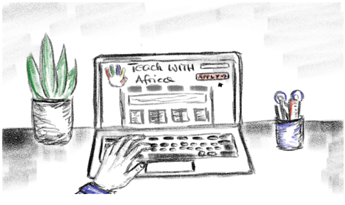
4. Suddenly Elena finds the TWA website. She is so impressed to find everything she wants on their homepage. With their easy navigation and perfect design, she knows that this was the program she wants to apply for.
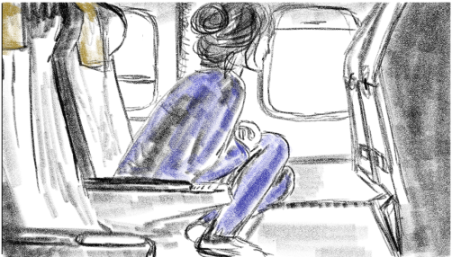
5. After successfully applying, she got accepted into the program and she starts her experience abroad.
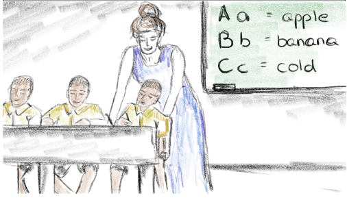
6. Happily teaching kids in South Africa, she knows she would recommend this program to others and she is so glad and joyful to get this life-changing experience.
sketch by Ariana Horn
Problem Statement
Education shouldn’t be a privilege, it should be a right. Many countries suffer from a lack of resources and aren't able to offer a proper education.
Teach with Africa is a non-profit organization that provides a path for educators to engage with and contribute to communities in South Africa.
After our research, we discovered that rather than encouraging educators to pursue their career goals, the TWA website discourages educators from enrolling in the program.
How might we help encourage Elena and other educators to participate in this program, and provide a seamless website user experience is our goal.
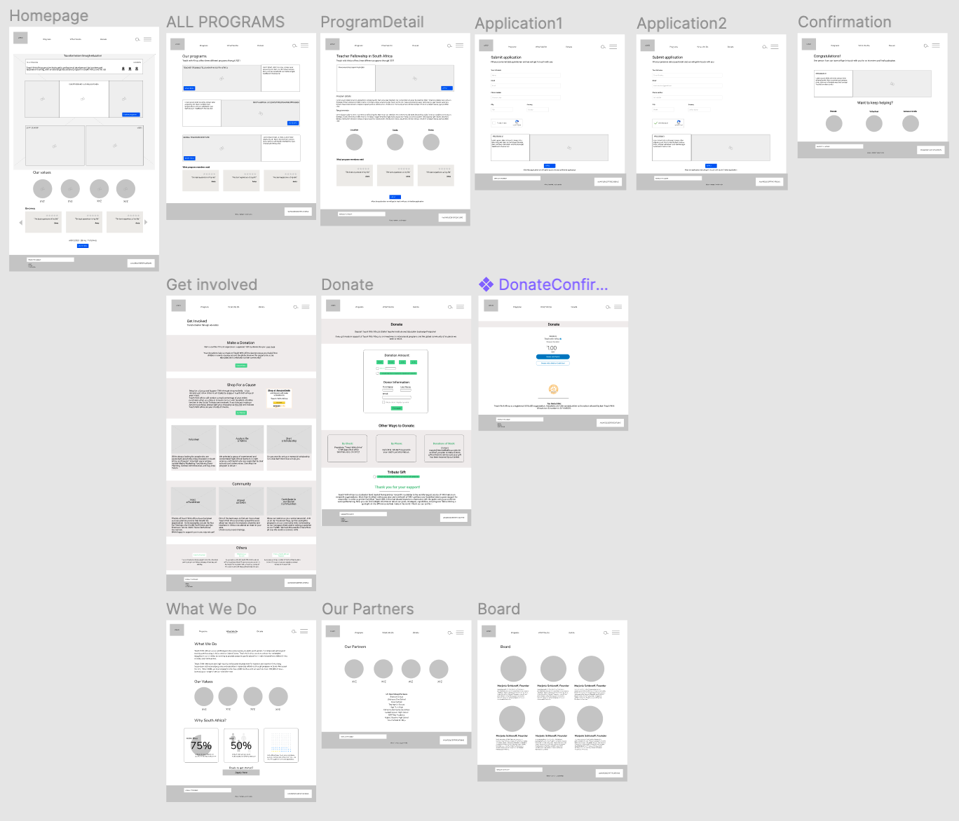
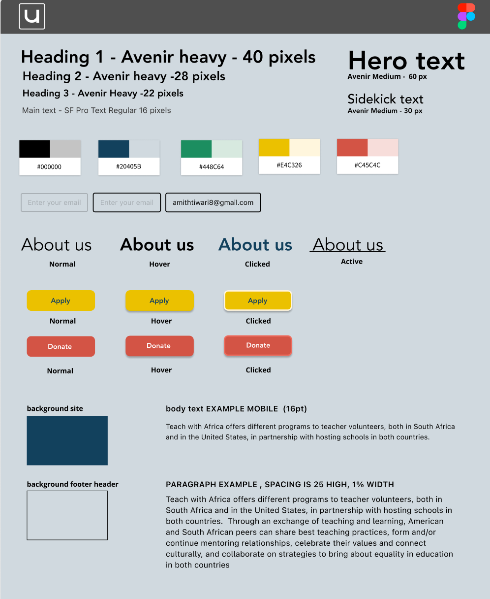
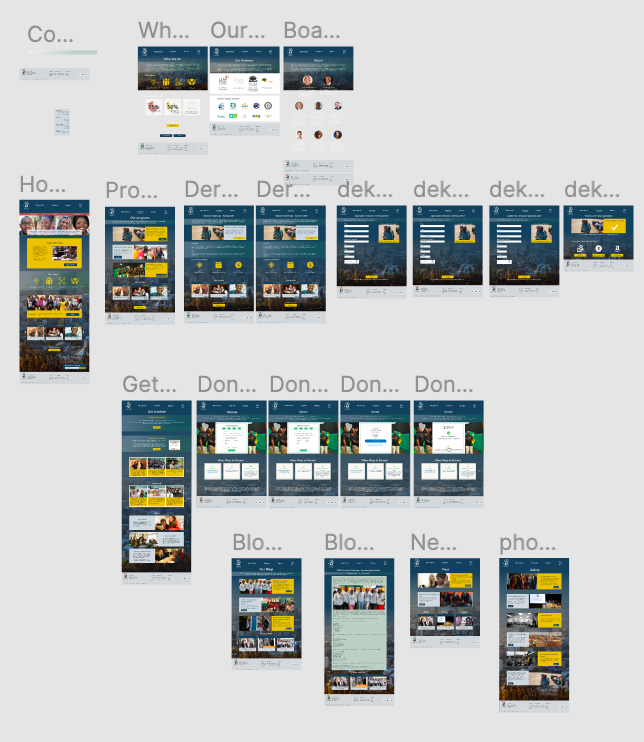
LOFI - STYLE GUIDE - HIFI Prototype
Testing and Final Thoughts
Feedback on Web-Prototype
For both desktop and mobile, our users said that the website was easy to navigate.
They also noted that it was easy to apply to a program and donate.
Desktop Feedback:
Homepage was confusing and not appealing above the fold
Mission statement was wordy and difficult to understand
Buttons were small and copy was not clear as to what they led to
Some cards aren’t clickable
No “apply” buttons on homepage
What's next?
After finishing the prototype testing and final style changes, we showed it to the board of "Teach With Africa". Design, navigation and content were absolutely on point to their wishes and thoughts. Unfortunately, we weren't able to use our design as their new website design so far, but still being in close contact with them for a later work together.